Woolworths: Designing a signup journey in checkout
Available for projects
Company:
Woolworths
Project context
OVERVIEW
What is this?
This project looks at my journey in designing a signup experience for Woolworths' Delivery Unlimited subscription service within the checkout area of the Woolworths e-commerce site.
DETAILS
My role:
User research, Interaction, Visual design, Prototyping
Impacts
1. Highest rate of signups across all subscription signup flows
2. 11% increase in subscribers per month
3. Reused in Everyday Extras design version
Constraints
‣ 2 month deadline
‣ Must align to Woolworths checkout design ethos
Background
Context
Delivery Unlimited is a subscription delivery service Woolworths offers for online deliveries. At the time I was working on it the subscription service offered free delivery to orders above $50 and a slew of minor value points as well.
The data for page traffic indicated that somewhere from 14-20% of traffic to our landing page was driven by a banner in checkout.
Most of these customers would immediately leave our landing page when arriving from the checkout banner.

Featured above: data I had gathered from Hotjar. You can see customers on the left tended to click on elements that weren't clickable (example, the 'sticker' in the banner on the top right) and only 60% of customers even made it to the section of our page where choosing a plan was an option.
Core Problem
Checkout is cognitively overwhelming: Users are checking for specials, making sure they have all the items, checking if they want substitute items if there's no stock of their selection, weighing up the cost of delivery vs picking up groceries and checking if they have time for it, ect.
Starting a subscription is overwhelming: Most users have experience in managing and signing up to subscriptions. For instance, if told to speculate on what signing up to our subscription service means, most users could accurately guess that it'd mean some combination of entering card details, selecting a plan, entering personal information, ect.
Users are unlikely to exit one overwhelming journey when they're almost at the end to start a new journey with unclear value.
Solutioning
Feature Hypothesis: A modal-based journey that keeps the signup process in page will have an increased rate of conversions for customers who start it compared to the checkout banner that directs customers out of checkout towards our landing page
Early solutions thinking
Signalling ease of use: The newly designed experience to users early on that it's not going to be as lengthy as a regular signup journey to complete.
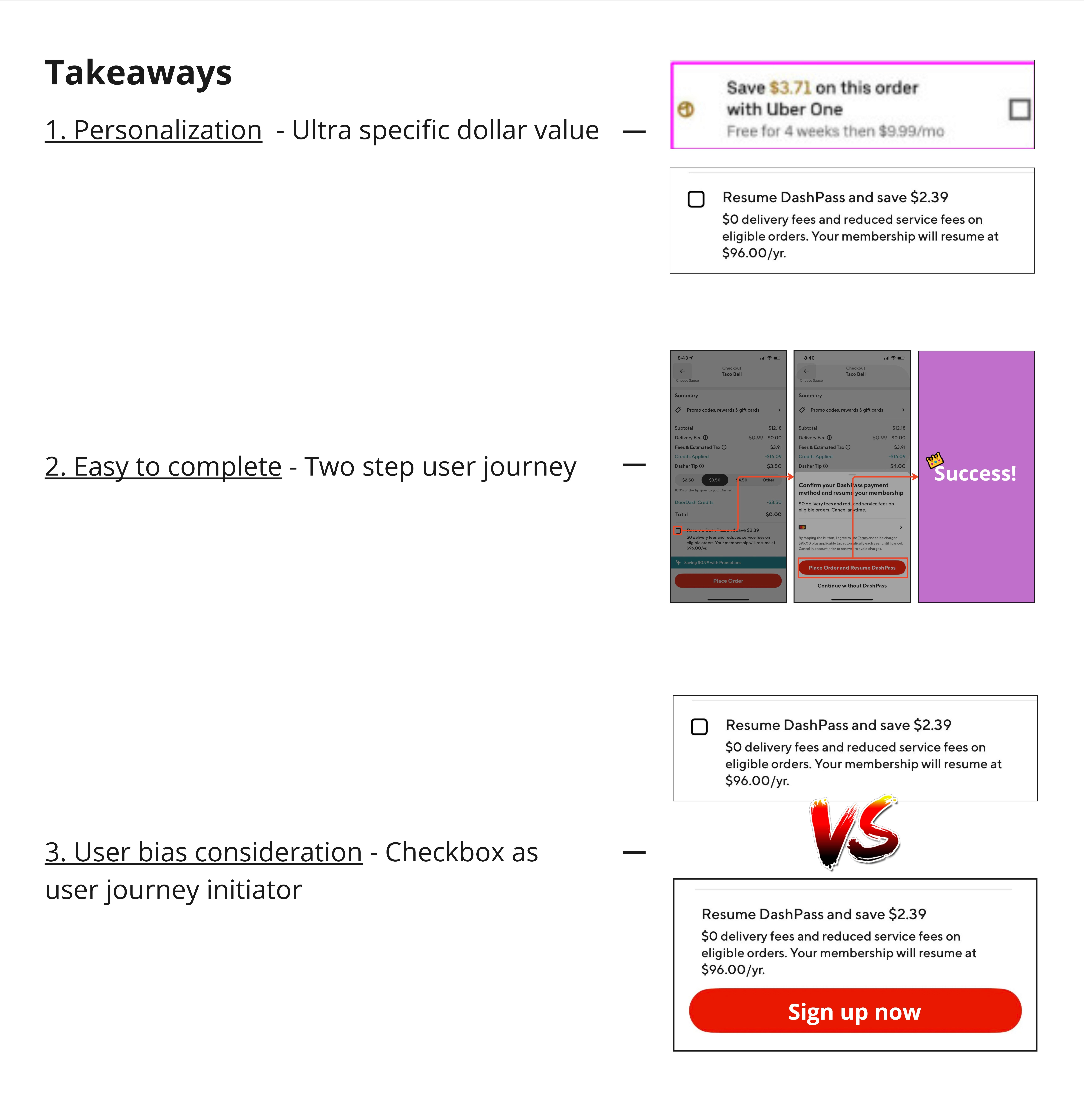
Personalization: Personalizing the banner with the user's name and (as best as possible) an exact dollar amount based on past shop history will help drive engagement more than showing users a potentially higher but more generic dollar figure.
Convention breaking: Exploring designs that are initiated with action buttons that customers associate with being small modifications to their order (like checkboxes) would be preferrable to buttons.
Design challenges
Banner blindness: This content would come in the form of a banner, and users as a whole don't engage with our banners and advertising particularly well.
Limited space for content: In 25 characters or less the banner needed to communicate enough value to make the customer interested enough to engage with it.
Negative impacts from customer associations with subscirptions signups: If customers percieve this to just be a regular signup journey, they're unlikely to want to exit the end of one journey (shopping) to start a new one.
Research
Desktop research learnings
Personalization: The best competitor experiences call out value in a hyper specific, personalized way. Uber being willing to call out it's value down to the cent makes me as a customer feel that the figure's being calculated based on my shop history, without needing to explicitly spell that out, and I trust that figure more when evaluating if I'd get value from a subscription.
Speed of signup: Both Uber & Doordash both have journeys that can be completed in two clicks; this is critical in a high stress area like a checkout page.
Breaking convention: Uber/Doordash use checkboxes instead of 'sign up here' buttons to start their modal based signup journeys. My assumption for why this is the case; a button signals to users that you're exiting the page and starting a journey, a checkbox signals to users something lower stakes and (in the context of a checkout) more of a small modification on the delivery.
User Testing
Session details
Format: Online moderated online user testing, comparing two different user journeys
Sessions run: 66
Participants: 3 male, 3 female. All having an average shop of once or twice a week and participants self reporting to spend over $75 an order.
Prototype
Design A: Button and plan details included
Design B: Checkbox and no plan details included

Session results:
Hypothesis: Banner blindness will prevent the user from noticing the journey initiator
We will know this to be true when: Users require moderator intervention to continue the scenario.
Result: True, most users wouldn't organically engage with the modal. This wasn't necessarily a negative for the project and was in line with how we expected users to interact with banners.Hypothesis: Users prefer prototype B because it avoids the additional layer of decision making of picking between monthly or annual plans.
We will know this to be true when: When asked to list their preferred design, users preference prototype B.
Result: True, most users preferred being able to see all context for their subscription.Hypothesis: On noticing the banner users will have a positive reaction to the personalization (the use of user placeholder name & estimated saving's figure) featured in the banner's copy.
We will know this to be true when: When discussing the banner, users indicate a preference for wanting to understand how the banner's figure is calculated or remark positively on the banner or figure.
Result: True, most users indicated a prreference for at least investigating how the figure was calculated. The best comment that reflects this is a user remarking that it's like a personal recommendation from WoolworthsHypothesis: $15 of value is enough to make the user temporarily exit this journey (completing an order) and start a new one.
We will know this to be true when: Majority users indicate that $15 per month of value would be the price point that would make them want to find out more about a service.
Result: Unclear; while most users who were asked this question indicated yes, more users would need to be tested with to have a conclusive answer.
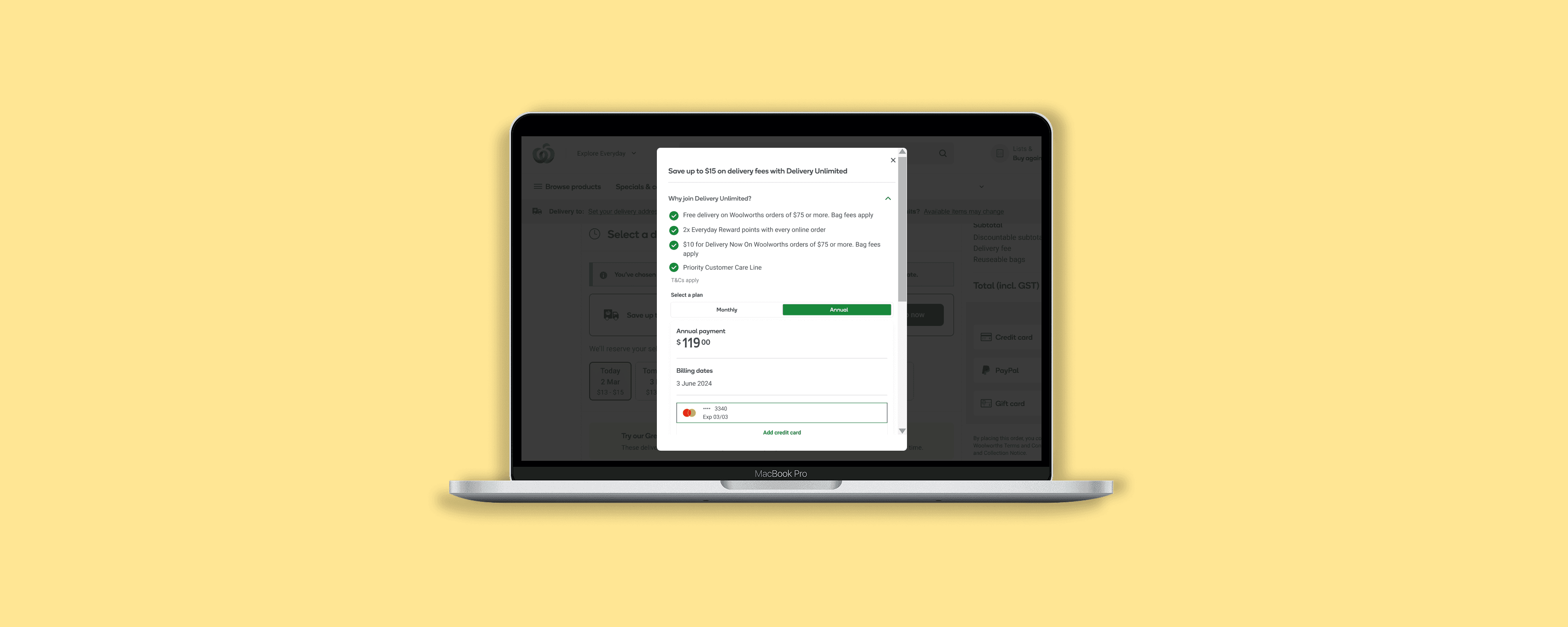
Final design
Learnings
Customer perceptions on what something does matter as much as what it actually does
How long will someone look at this design for and what do I need to convey to them in that time
How much value would motivate the customer to do this action?

