User Interface Design
Data Literacy
User testing
User Experience Design
Loyalty Subscriptions
This project looks at my journey in designing a signup experience for Woolworths' Delivery Unlimited subscription service within the checkout area of the Woolworths eCommerce site.
→
Risk of ecom profitability disruption
→
Customer perception of signup journey tasks
→
Cognitive bandwidth
→
Banner blindness
→
Limited space for content
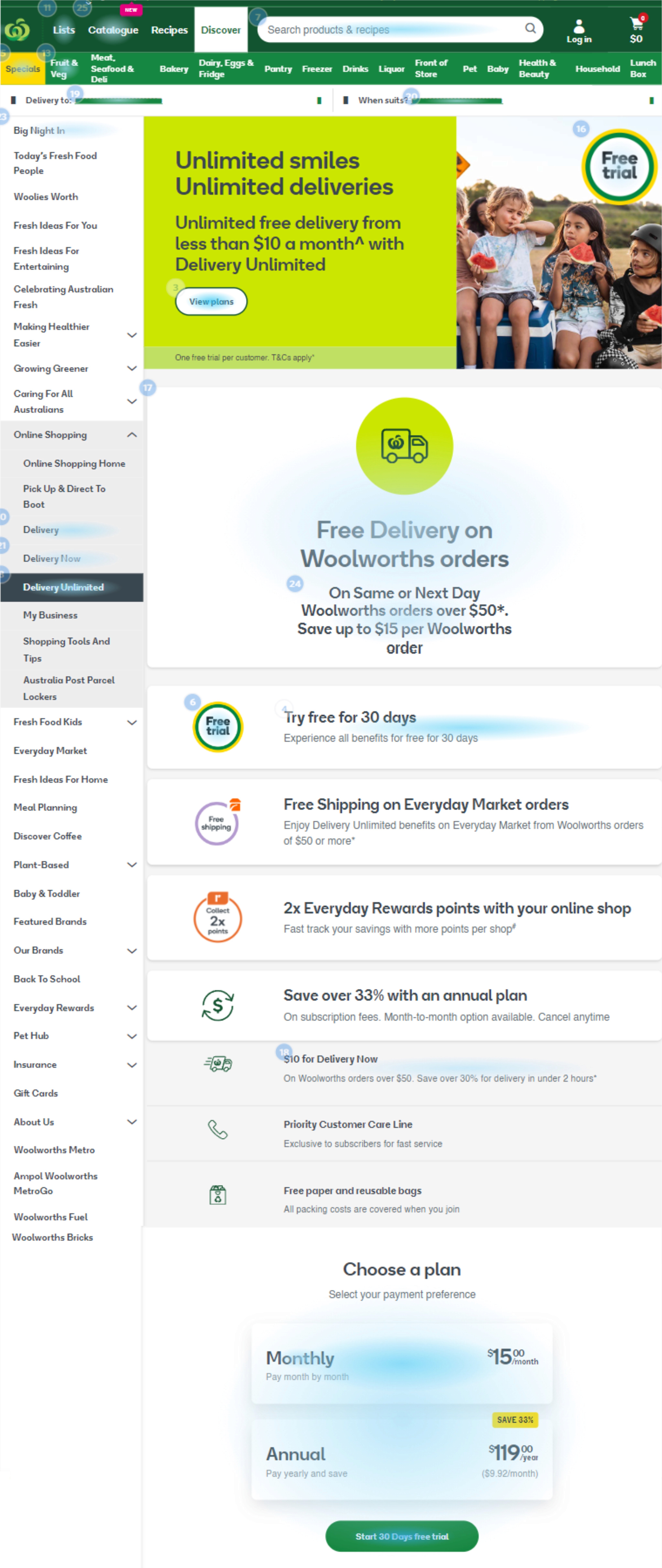
Image A: Mouse clicks
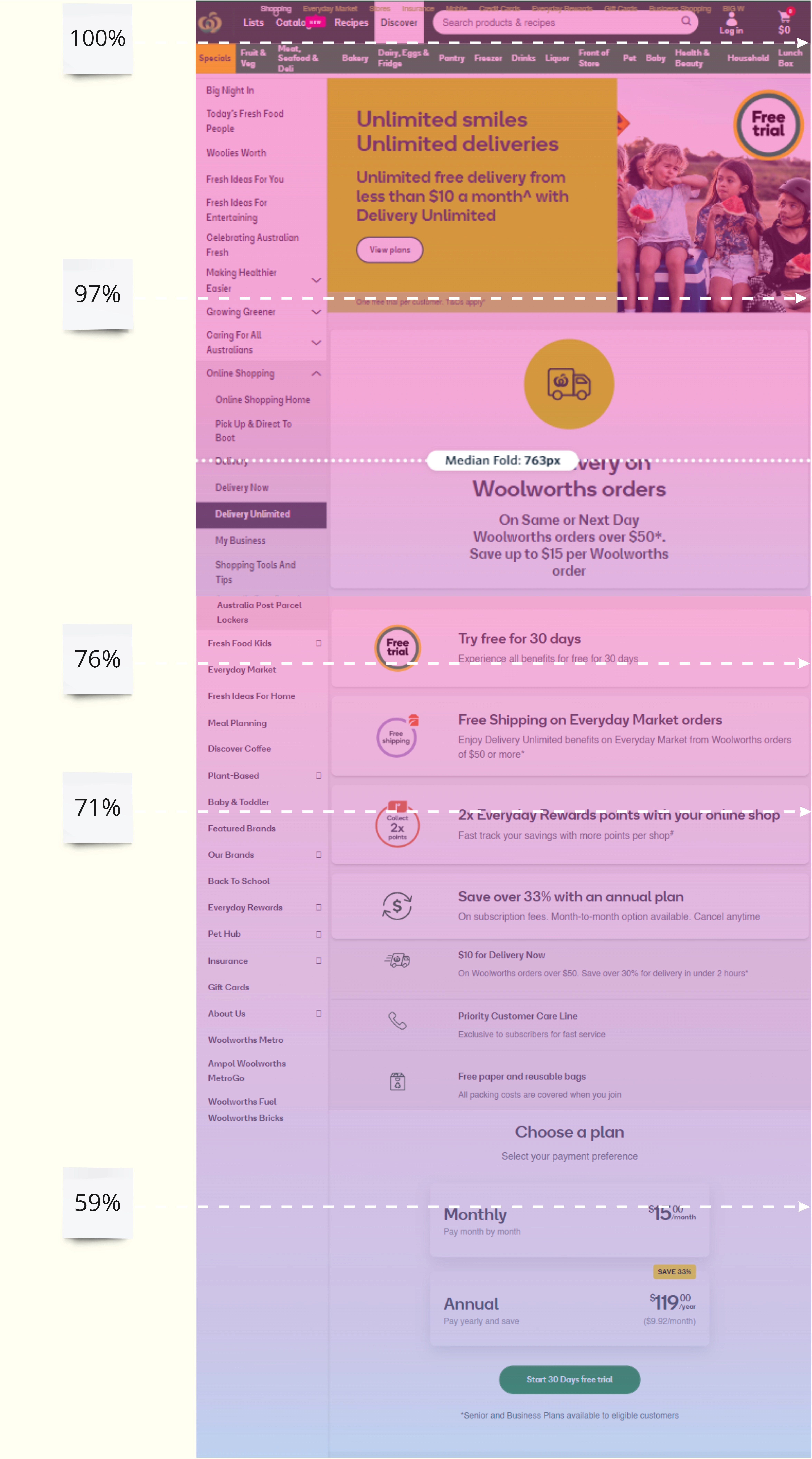
Image B: Page scroll percentage
Desktop research
Why checkout?
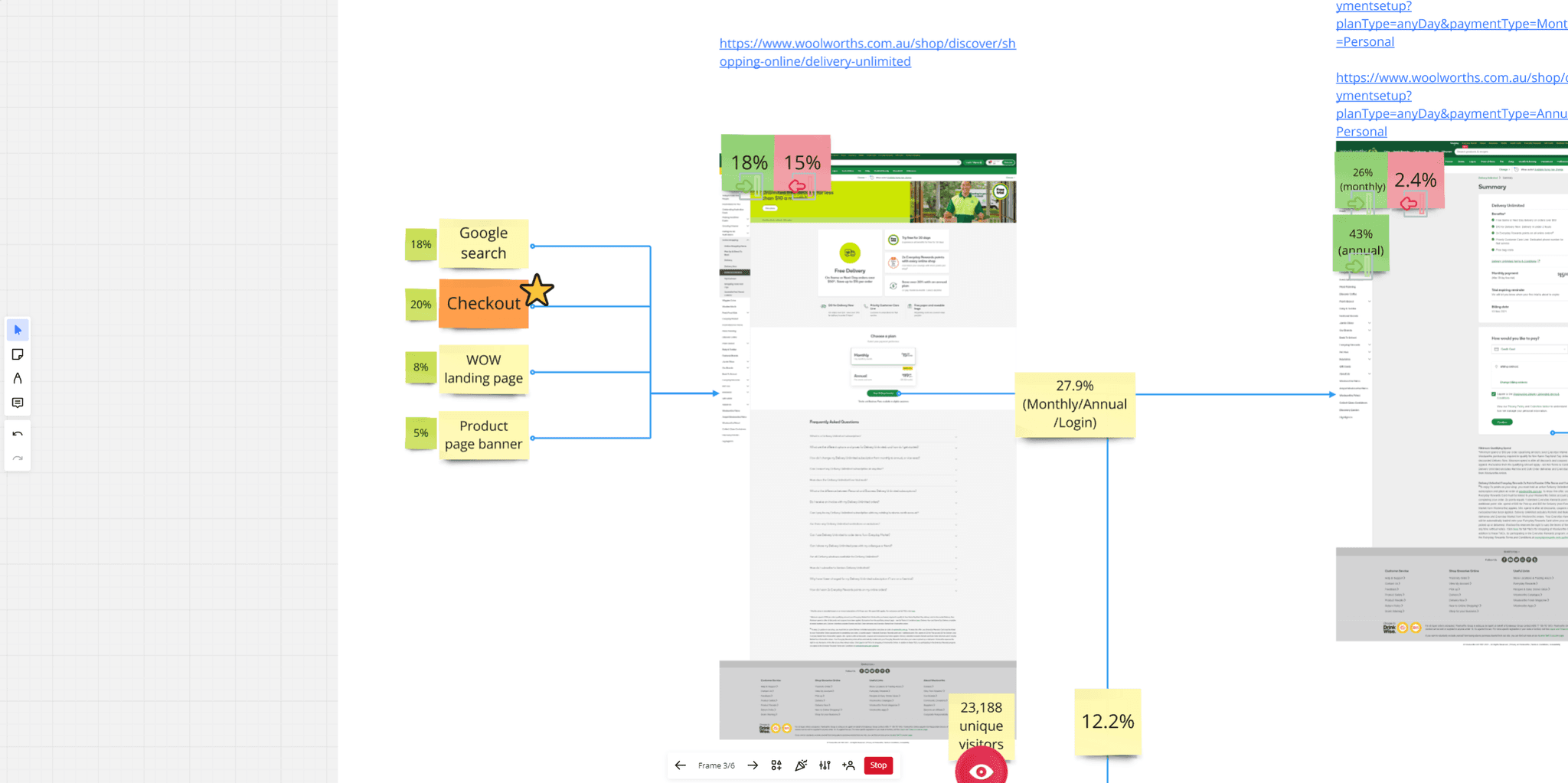
Path to signup analysis
▪️
20% of our landing page traffic originated from a banner in checkout
▪️
73% - 80% of customers exit the journey from the signup landing page
Landing page Analysis
Given that the landing page appeared to represent a weak point in our journey, I decided to analyze it further.
▪️
Image A: An aggregate of customers who visited the landing page's click locations - a large amount of these clicks weren't necessarily on things that were interactable, indicating confusion with the experience.
▪️
Image B: Most customers don't make it to the 'Choose a plan' section to pick a plan and progress to the next stage of the journey.
Recommendations:
▪️
Sign up in checkout: Given that a high percentage of customers reach the landing page from checkout, and that it represents a space in which delivery costs are front of mind, how might we enable customers to sign up to our service from that location?
▪️
AB test landing page: What quick ideas can we generate to improve our landing page, and what theories can we test with our new signup from checkout experience that we might feasibly integrate into our baseline signup journey?
Prototyping foundations
Competitor analysis takeaways
#1: Personalization
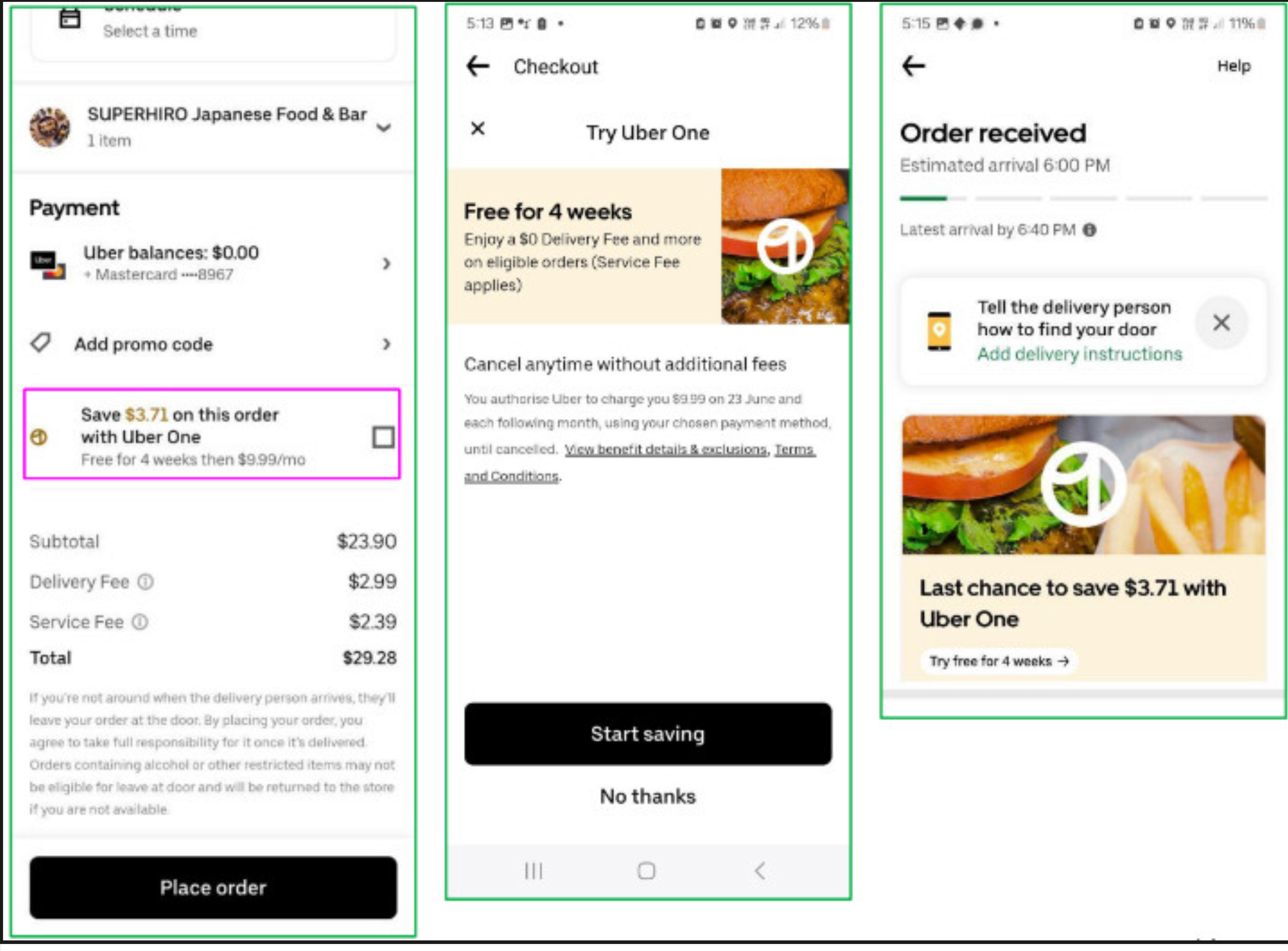
Example: Uber's $3.71 savings, that being such a specific figure that I'm prompted to investigate further.
#2: Speed of signup
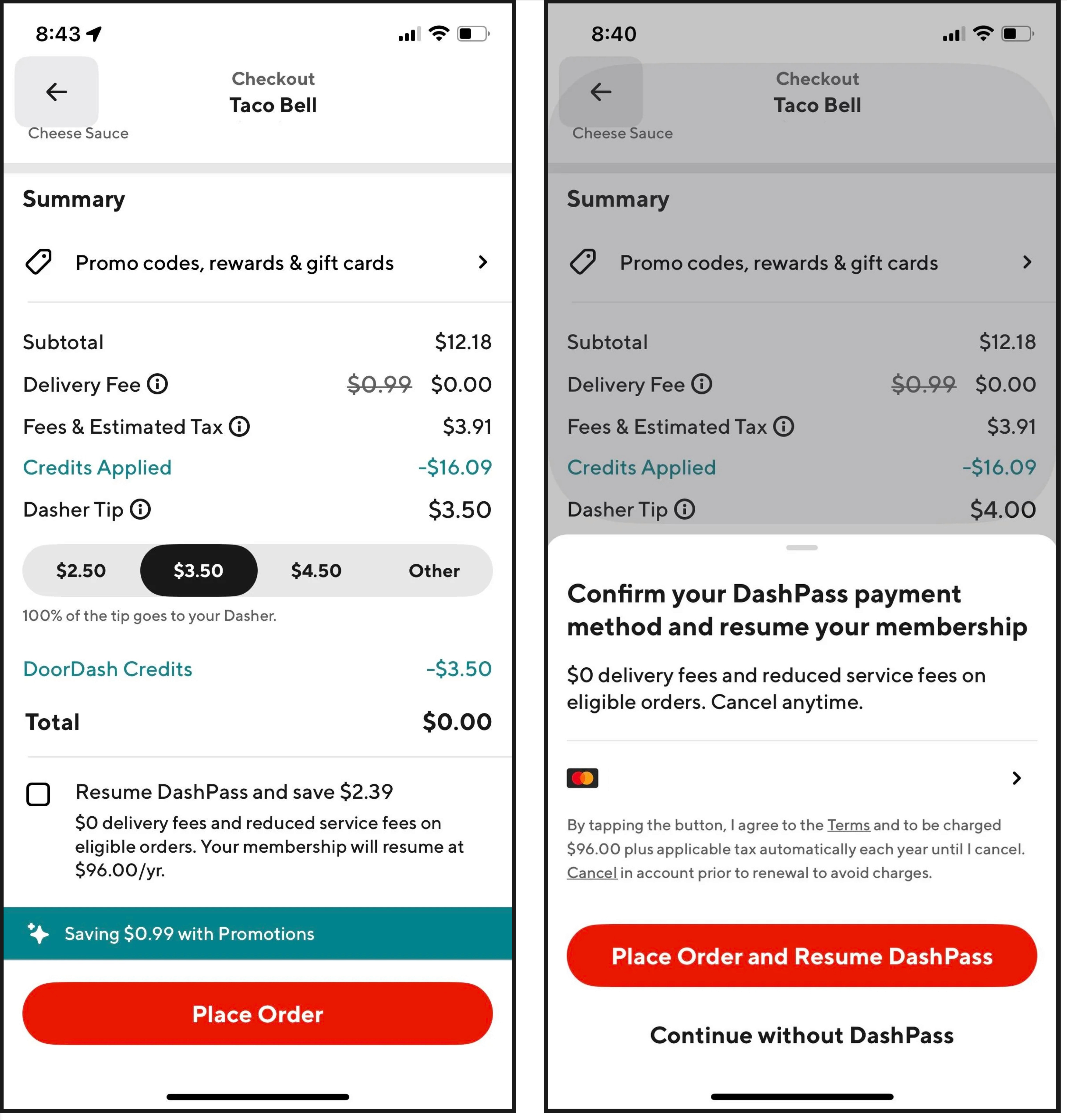
Example: Uber & Doordash both have journeys that can be completed in two clicks.
#3: User bias
Example: Uber/Doordash use checkboxes instead of 'sign up here' buttons because they don't have the same cognitive associations with customers. Users likely already have a good idea of what a signup entails - lots of steps, picking a plan, entering card details, ect
None of this is present in the existing journeys, but that won't matter if users think that it'll be a regular signup journey, and they're more likely to think that with a 'sign up' button.
User Testing Results
Prototype Error States


Final Design

